Sierra Azul Apartment
Monterrey, Mexico
2016

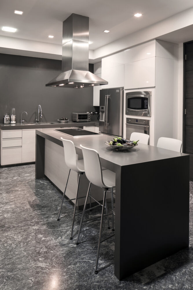
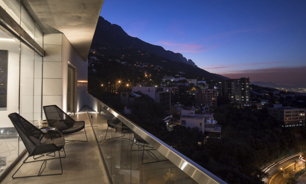
Located in one of the most exclusive residential towers in the city of Monterrey, this apartment it’s the perfect canvas for an interior design project. The range of materials includes: gris modena marble, oak wood, smoked mirrors and silk, leather, and cotton textiles. The combination of these materials surround each space on the apartment, and gives it a modern and…

Locación
Monterrey, Mexico
Categoría
Interiors
Año
2016
Info +

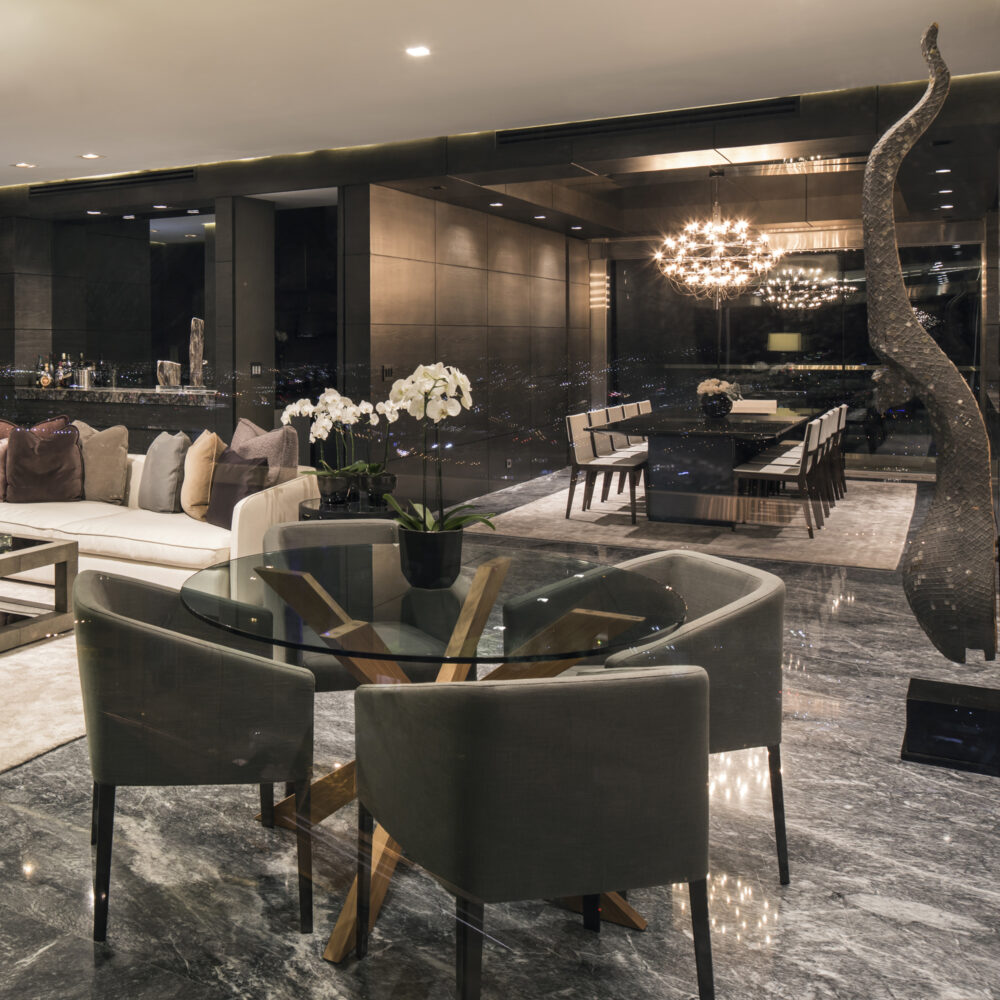
Located in one of the most exclusive residential towers in the city of Monterrey, this apartment it’s the perfect canvas for an interior design project. The range of materials includes: gris modena marble, oak wood, smoked mirrors and silk, leather, and cotton textiles. The combination of these materials surround each space on the apartment, and gives it a modern and sober look.

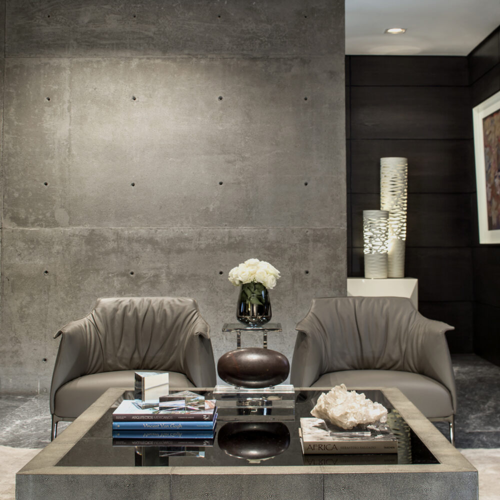
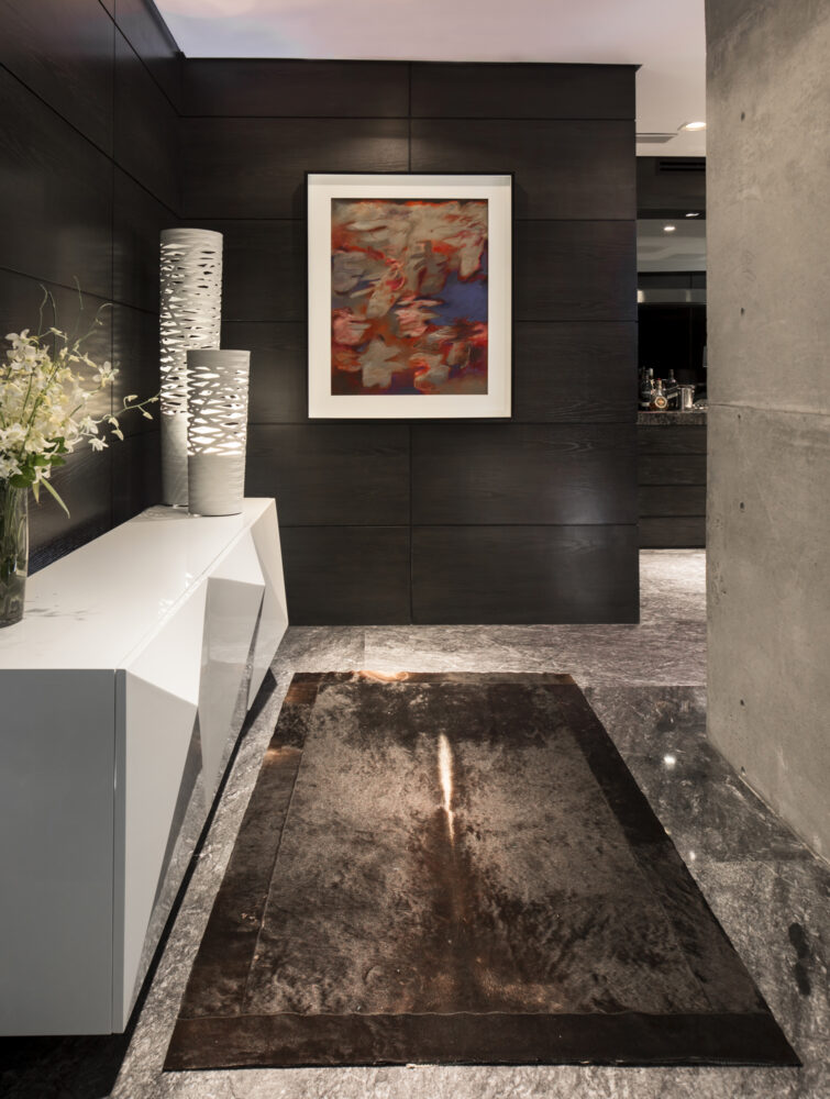
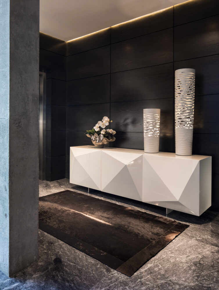
The entrance to the apartment is a small space with a duality of materials: on one side the walls are covered with oak wood panels and on other side, a modular concrete wall that enters the apartment from the outside, which is also part of the buildings’ structure, remains untouched. The white sideboard with a modern, geometric and abstract design, contrasts with the wooden panels which have a darker tone.

As you enter the apartment, you can see that the living-dining room area is the heart of the project. In this space the living room, dining room, bar and breakfast table coexist. The oak wood panels, which come from the entrance, frame the bar and continue to make their way around the dining room up to the hallway which connects the bedrooms and the hometheater. The oak wood panels hide the doors that lead to the different areas of the apartment, giving the apartment visual continuity and separating the main area from secondary areas.

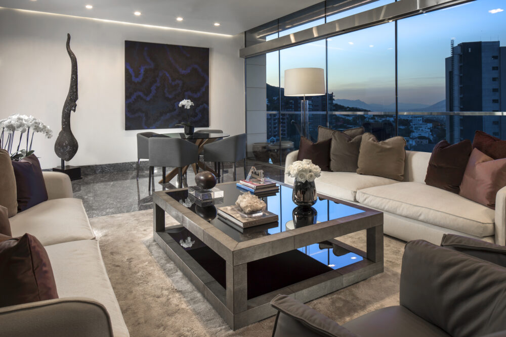
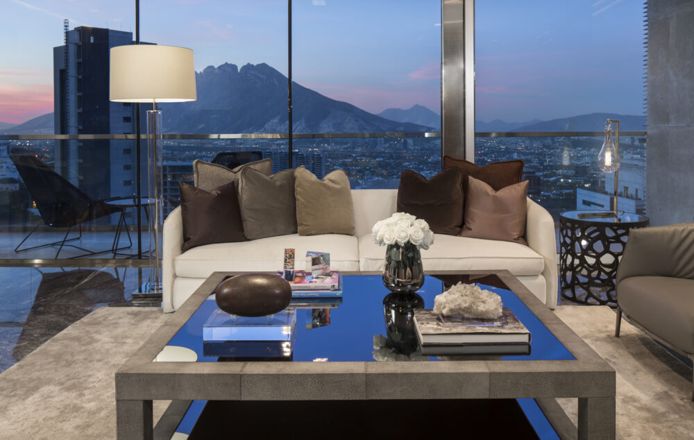
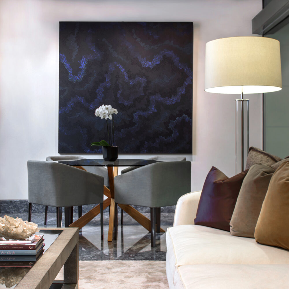
In the living room, neutral tones with color accents are used on furniture and accessories. On the farthest corner of the room, framing the breakfast table, the space is topped off with an oil painting by José Luis Cendejas, in blue tones, which brings to life the white wall where it hangs upon.

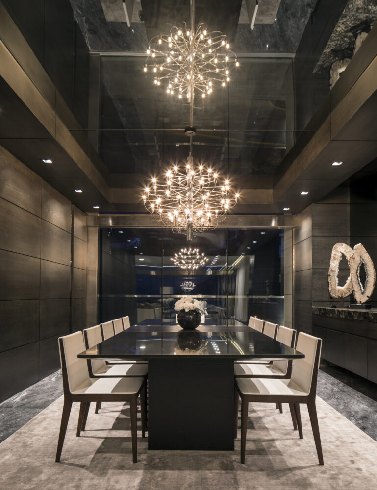
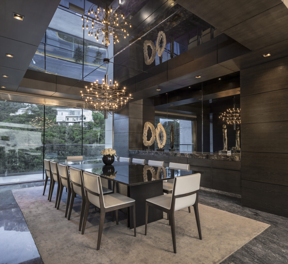
Without a doubt, one of the most emblematic spaces of the apartment is the dining room. The sober tones that materials and furniture give to the space, contrast with the chandelier which hangs from the smoke finished mirrors on the roof. The dining server, which is located between oak wood panels, has an orion blue granite top and a mirror wall that matches the ceiling.

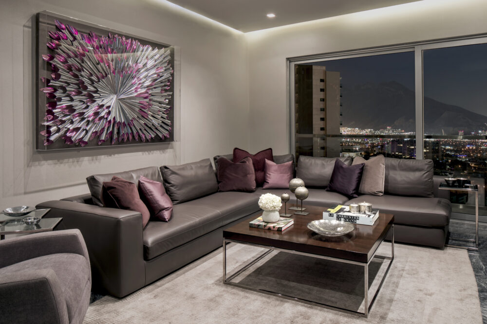
In the hometheater a playful combination between cold and warm tones occurs. The furniture, as well as the Karla Mayrl piece that hangs over the couch, both have metallic materials in silver tones, which contrast with the warm gray leather couch, and the walnut top on the center table. All these carefully planned contrasts contribute to the creation of this space, which is modern, yet cozy.
Extension
250 m2
Architect
Gilberto L. Rodriguez
Project Team
Pamela Díaz de Leon
Ana Caty Pozas
Gabriela Rodriguez
David Alatorre
Priscila Lopez
Photography
Jorge Taboada

Sierra Azul Apartment

View Project Back
Close ✕

Sierra Azul Apartment

Monterrey, Mexico
2016
Extension

250 m2

Architect

Gilberto L. Rodriguez

Project Team

Pamela Díaz de Leon
Ana Caty Pozas
Gabriela Rodriguez
David Alatorre
Priscila Lopez

Photography

Jorge Taboada

Located in one of the most exclusive residential towers in the city of Monterrey, this apartment it’s the perfect canvas for an interior design project. The range of materials includes: gris modena marble, oak wood, smoked mirrors and silk, leather, and cotton textiles. The combination of these materials surround each space on the apartment, and gives it a modern and sober look.

The entrance to the apartment is a small space with a duality of materials: on one side the walls are covered with oak wood panels and on other side, a modular concrete wall that enters the apartment from the outside, which is also part of the buildings’ structure, remains untouched. The white sideboard with a modern, geometric and abstract design, contrasts with the wooden panels which have a darker tone.

As you enter the apartment, you can see that the living-dining room area is the heart of the project. In this space the living room, dining room, bar and breakfast table coexist. The oak wood panels, which come from the entrance, frame the bar and continue to make their way around the dining room up to the hallway which connects the bedrooms and the hometheater. The oak wood panels hide the doors that lead to the different areas of the apartment, giving the apartment visual continuity and separating the main area from secondary areas.

In the living room, neutral tones with color accents are used on furniture and accessories. On the farthest corner of the room, framing the breakfast table, the space is topped off with an oil painting by José Luis Cendejas, in blue tones, which brings to life the white wall where it hangs upon.

Without a doubt, one of the most emblematic spaces of the apartment is the dining room. The sober tones that materials and furniture give to the space, contrast with the chandelier which hangs from the smoke finished mirrors on the roof. The dining server, which is located between oak wood panels, has an orion blue granite top and a mirror wall that matches the ceiling.

In the hometheater a playful combination between cold and warm tones occurs. The furniture, as well as the Karla Mayrl piece that hangs over the couch, both have metallic materials in silver tones, which contrast with the warm gray leather couch, and the walnut top on the center table. All these carefully planned contrasts contribute to the creation of this space, which is modern, yet cozy.
Comparte este proyecto

kubet kubet kubet kubet kubet kubet kubet kubet kubet kubet kubet kubet kubet kubet kubet kubet kubet kubet kubet kubet